| Vol 1, #8, May 5, 2009 |
|
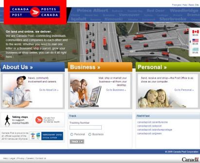
May 5, 2009 Petr Komarek, manager, Online Channel for Canada Post, says that a lot of research, conducted across the country over several years went into the new site. “We used a combination of customer feedback and web best practices to redesign our site into a channel that enables us to make our products work better together,” says Komarek. Komarek feels that having an effective online presence is extremely important for any business, especially one as customer-focused as Canada Post. “Having an effective, user-friendly website gives us one more tool to help our customers,” he says. The redesign included significant back-end architecture updates that make it easier to publish and manage content more efficiently. “There are a lot of other changes coming to the site as well,” says Komarek. “Going forward we’d like to look at Web 2.0 features now that we have a platform.” |
Contact Us For rates, opportunities, media partnerships, or to other information please contact our media sales department. {p: 905-201-6600} {t: 1-800-668-1838} Mark Henry Sales Manager, x 224 Peter O'Desse Senior Account Manager, x 223 Bill Begin, Director of Sales, 905-699-2781 Steve Lloyd, Publisher, x 225 Amy Bostock, Editor, x 221 |
